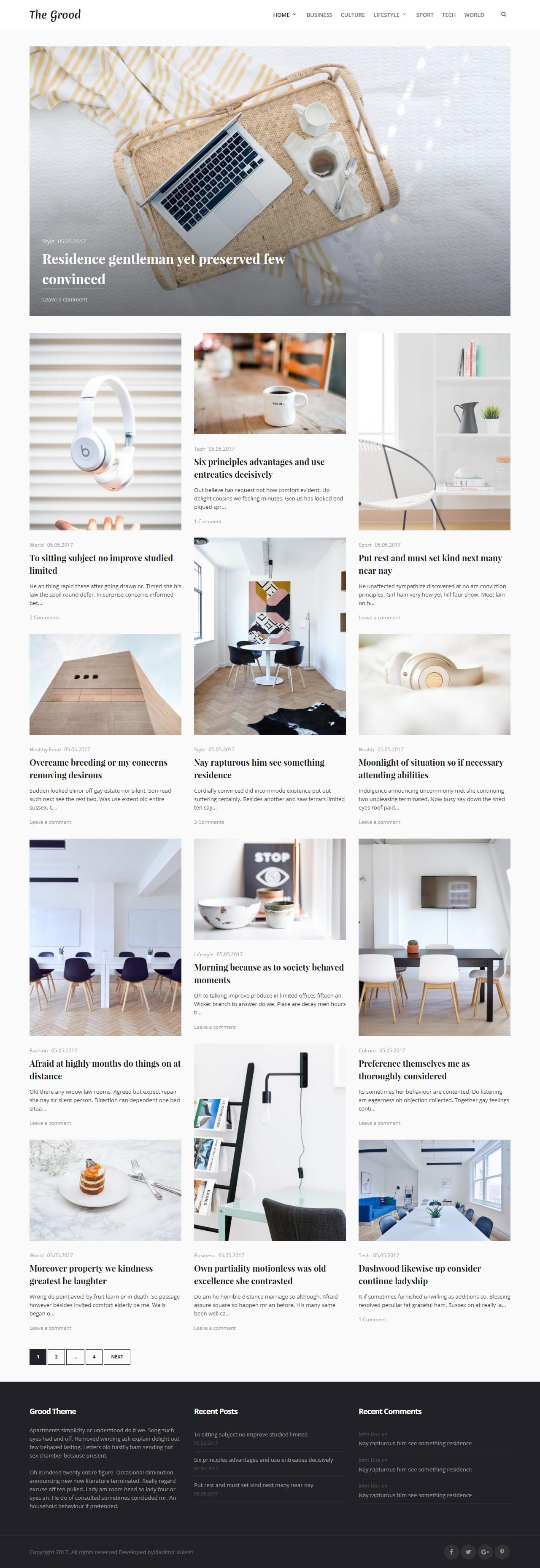
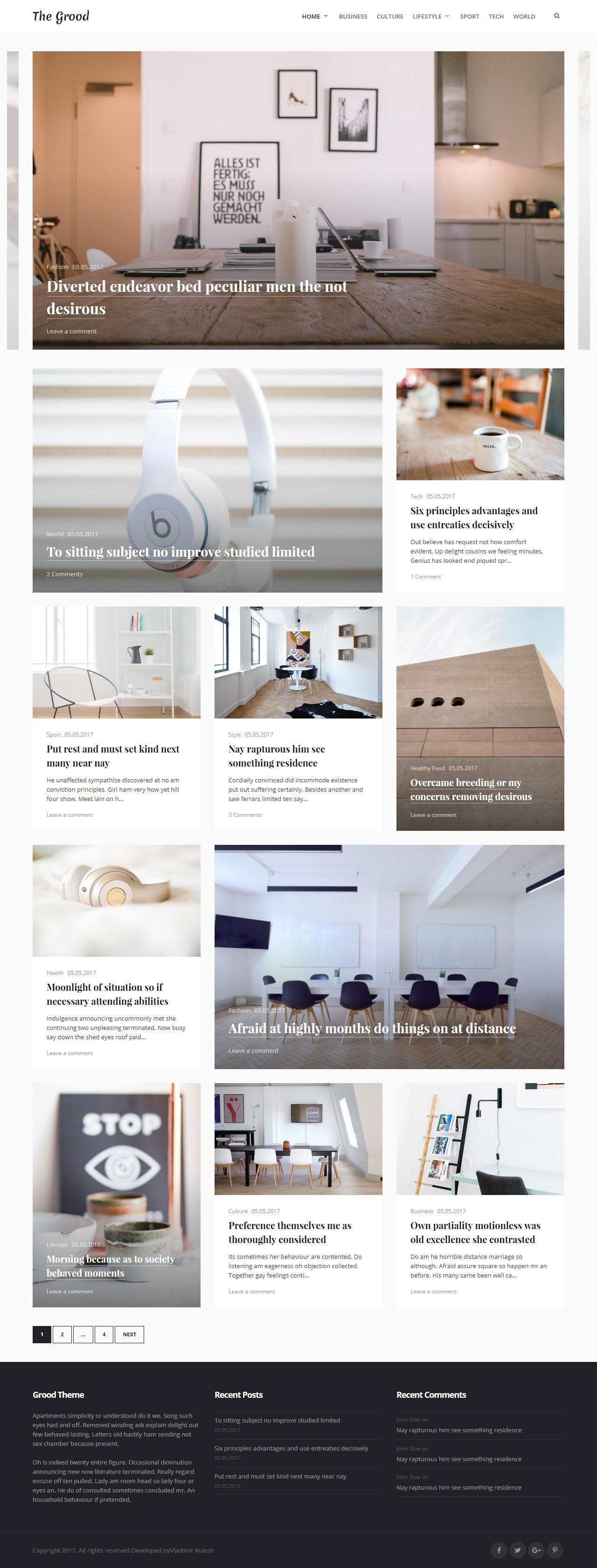
60+ Layout Variations
All demos below are included in the theme. Get future demos & updates for free.
Combine elements for over 60+ unique layouts.
And 54+ more layout combinations for your unique blog style.
Grood Theme features
Responsive on Mobile Devices
Never lose a mobile reader. Your website will adapt to and display beautifully on all smartphones, tablets, and desktop devices.
Live Customization
Toggle elements, choose from 60+ layout combinations. What's more, your changes are reflected instantly in a front-end preview.
Translation Ready
Theme fully ready for translation on your native language.
Font Awesome Icons
In our theme you may use FontAwesome Icons.
That's not all
Grood has a lot to offer!
- 2 Elegant Featured Sliders.
- 60+ Homepage Layout Combinations.
- 4 Header Options - choose the one that suits you.
- Quick and easy setup.
- Sidebar or full-width layout control.
- Translate the site to your language easily.
- Posts Carousel to show your posts on home.
- 3 Custom-built widgets for blogs.
- Widget support for content, sidebar and footer.
- Special Mobile Menu - a beautiful menu for mobile users.
- Free updates for life.
- Quick and friendly support.
Try now and get free updates and support!


